 |
 |
|

| VCLSkin | |
 |
Feature |
|
Purchase |
|
Download |
|
Skin Builder |
| Screenshot | |
|
Vista Style |
|
Office 2007 Style Skin |
|
XP Style |
|
Other skin style |
|
Control and Form |
| Tips | |
|
Caption and Mainmenu |
|
TSkindata.skin3rd |
|
|
|
|
|
|
|
|
|
|
|
| Skin 3rd Controls | |
|
|
|
|
|
|
|
|
|
|
|
|
|
|
|
|
|
|
|
|
|
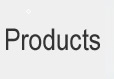
Skin Builder V5.0Skin builder v5.0 support to create VCLSkin skin file from Xp visual style (*.msstyles), You can get 2000+ skins now! 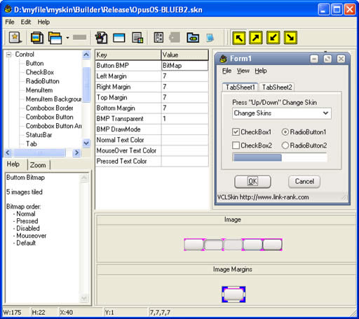
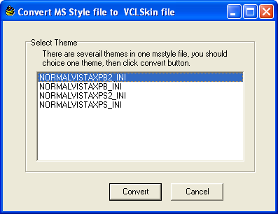
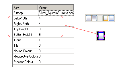
1. Click "Import" button in toolbar. 2. Skin Fundamentals The first step in learning skin is to understand how it works. Unlike some apps where you create a mostly static skin, Vclskin must work with the dynamic environment of Windows. The various windows and buttons change shape and size with each program, so Skin must adapt your graphics to each item. It is important to keep this in mind when creating your design. With the code, you are able to set how many pixels of the image around the border, are to be left alone. The rest of the image is then stretched or tiled (as you specify) in order to enlarge or compact the image as needed. 3. Image
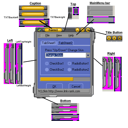
4. Windows Border and MainMenu
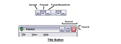
There are also two other possible image states: inactive and active window. The active window is the window that is currently being used, while the inactive window is any window(s) that is in the background. 5. Title buttons
6.Button There are five different states for the buttons image, each displayed at a different time.
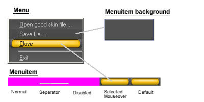
7.Menuitem
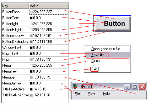
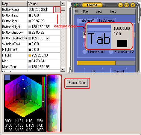
8.Color
Pick color and capture color
|